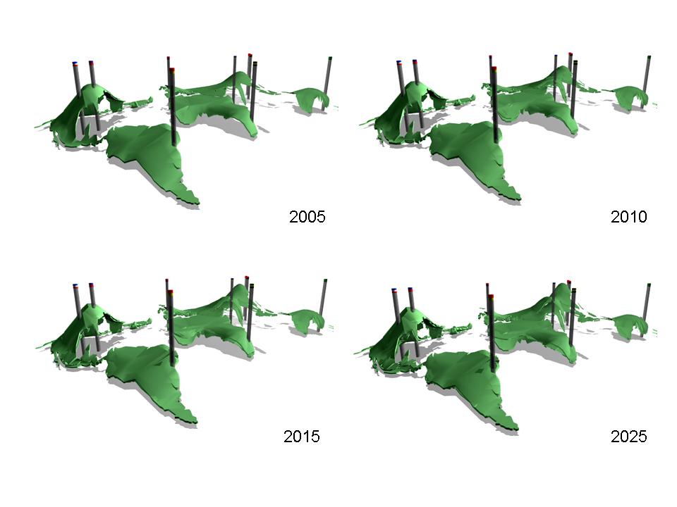
Monday, October 30, 2006

Segue Cities


After last week's review I have refocused my mapping to incorporate more than just the plotting of air traffic data. I have chosen to attempt mapping all of the major networks of transportation for people and goods including major air routes, shipping routes, interstate networks, and railway networks. These systems will be mapped over a plotting of the world's mega cities (that is any city with more that 10 million inhabitants); the idea is that when all of these layers of information are superimposed over one another, the map will reveal the most important "Segue Cities" of the world, that is to say, the cities which most control the movement of people and goods around the globe and in many ways, control a large factor of the global economy and the conditions many people around the world face.

I hope that these Segue Cities can become sites for a new system of global interaction. I suspect that many of these cities will encounter similar problems of population growth, unsightly conditions around the port areas, and a general confusion and inefficiency of distribution of people and goods. I plan to analyze the largest Segue Cities an pose a plan for the construction of an off coast island which could perhaps serve an of shore port/airport for a more efficient distribution of cargo and passenger traffic.

One very interesting corner is the North Sea. London and Paris are two mega cities which depend on a large import export business; the London, Paris, and Amsterdam airports are among the worlds largest, four of the world's largest ports are located here and finally, all of the countries in this general area contain strong rail and interstate networks. As the population continues to grow and more pressures are felt of the expansion of airports and ports what could a solution be to make the transport of goods and passengers in and out of the area more efficient. Inspired by an earlier case study on Kansai International Airport in Osaka, I began to wonder if it would be possible to build an island in the North Sea which would serve as a major airport and seaport to receive and send northern Europe's goods and passengers throughout the rest of the globe. A chunnel type system could allow interstate highways and trains to access the island working with the seaport and airport.

Thus, I hope that the map will reveal some of the world's most important Segue Cities; the cities that ship and distribute most of the world's goods.

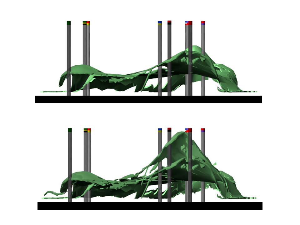
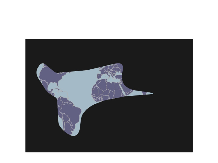
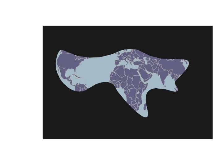
This excel spread sheet is a quick matrix of what the map will try to show graphically. The following are two images from an early attempt at the new mapping:


Monday, October 23, 2006

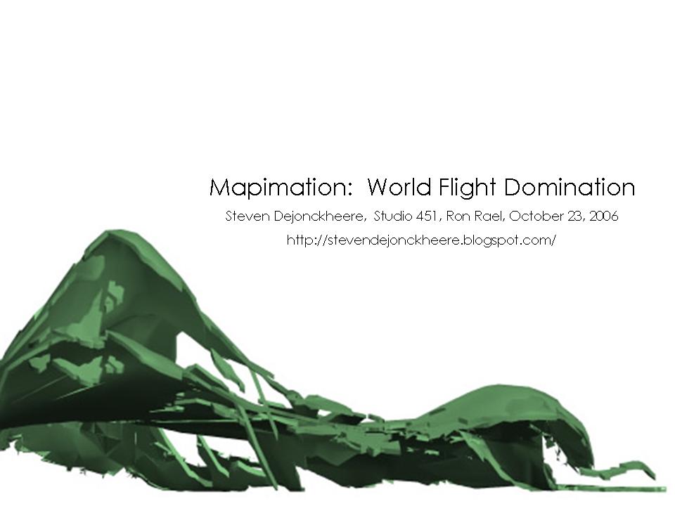
Mapimation PowerPoint


Here are the Mapimation videos: video 1, video 2


Wednesday, October 18, 2006

Mapimation Latest Updates

Here are my latest mapimation images, hopefully a video will follow shortly. Only two airlines are mapped here and the trial video to come is not modeled after accurate data, but it'll give you the idea. Let me know what you think.


Tuesday, October 17, 2006

Mapimation Update

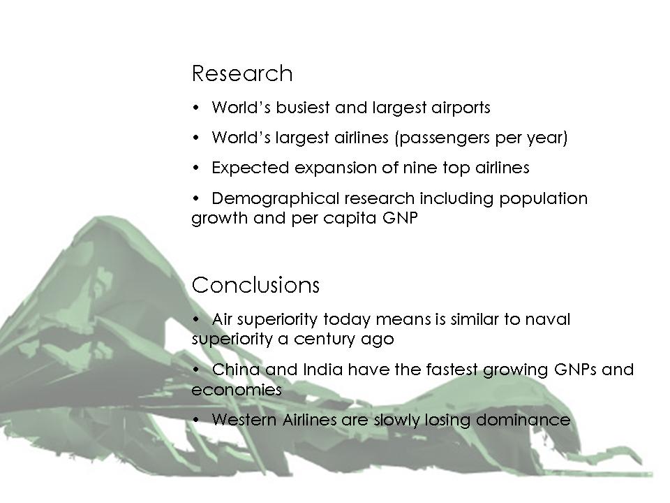
Modern travel, especially air transportation connects today’s world—air travel connects people and goods with any corner of the world within 24 hours or less. Yet the globe’s 15 largest airlines only represent seven countries. Though less realized, air travel holds similar status today to marine travel a century ago. Until recently, the measure of a nation’s power could be gauged by the size and power of its navy. Today, air dominance holds a similar status. A century ago, wars were won by ships, worlds were connected by ships and all goods crossing oceans were freighted on ships. Today, air superiority wins wars, one can fly to any corner of the world within 24 hours, and 36% of the value of all goods traded around the are world flown to their locations (pretty good considering that this 36% of value constitutes only 5 percent of volume, all other goods are moved via ship, truck, train or other mode of transportation). Air domination today is equivalent to naval domination centuries ago.

Of the 15 airlines mapped, seven countries are represented and coincidentally these countries have recently been some of the largest players in world affairs. Upon research of further statistics one finds that two major demographic factors become very telling of which countries retain air dominance. All of the dominant countries have populations over 40 million (except Australia) and a GNP per capita income in excess of the equivalent of 26,000 USD. There are many countries with higher populations for instance China and India, however, the per capita income in these countries is significantly lower than in the countries of air superiority. Other companies such as Luxemburg or Norway, have among the highest per capita incomes but their populations are to small to support a major air transportation industry.

Some exceptions to occur, Australia for instance has a relatively small population and yet Qantas Air slides in as the worlds 13th largest airline according to passengers per year. Canada also seems as if it could qualifiy to have an airline in the top 15 yet Air Canada is barely excluded in the top 15 and comes in at position 19. However, neither of these exceptions or any others are far out of the theory that there is a strong correlation between a country’s population+per captia GNP versus that country’s air superiority.

My map intends to explore the spheres of influence of the major airlines and the countries they represent and it goes further attempting to predict future dominant powers as represented by air superiority. Based on the growth of airlines and the rate of change in population/per capita GNP the map predicts which airlines will rise next to bring their countries to the economic forefront of the globe. The best prospect, no surprise, seems to be China. Already having the largest population, the Republic of China’s GNP per capita is increasing at an incredible 9.90%. Other good possibilities lie in Taiwan, Russia India and Iran, all of which have significant populations, sufficient resources, and above average economic growth.


Thursday, October 12, 2006

10.12.06

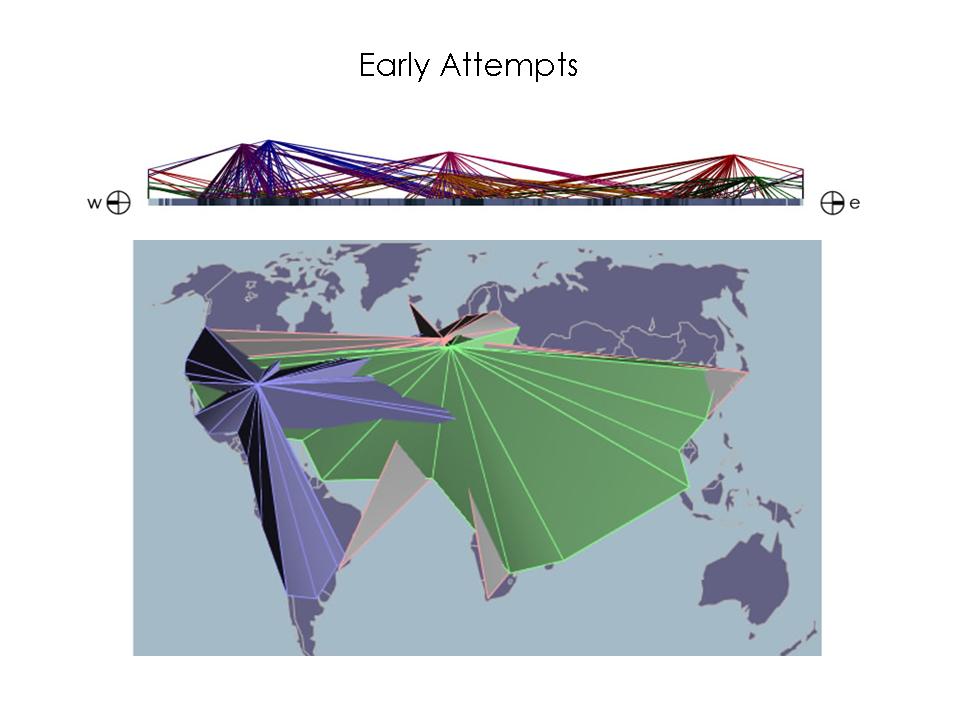
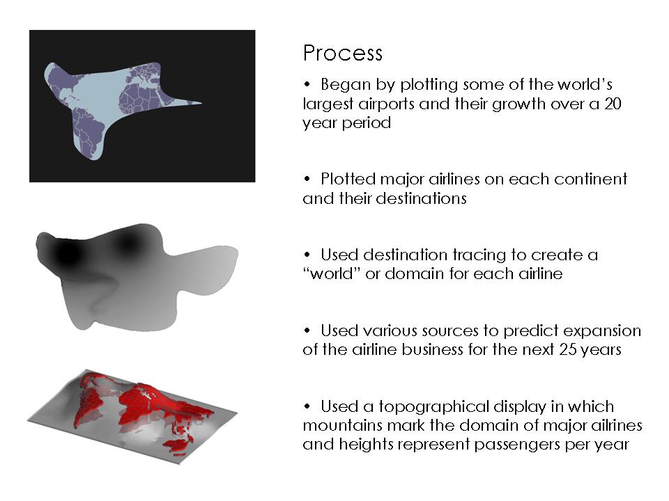
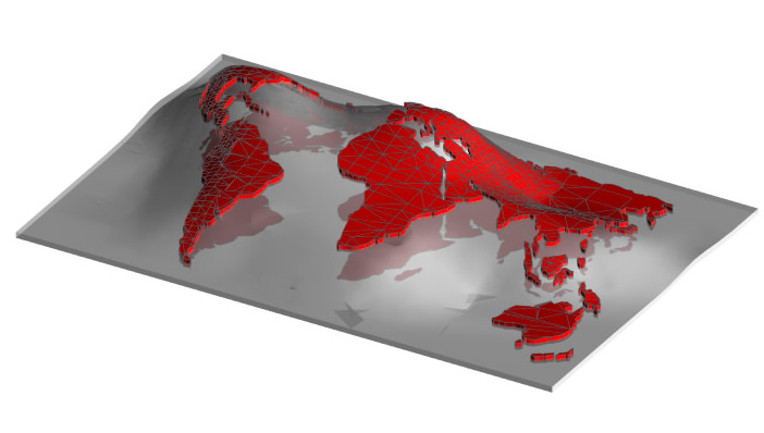
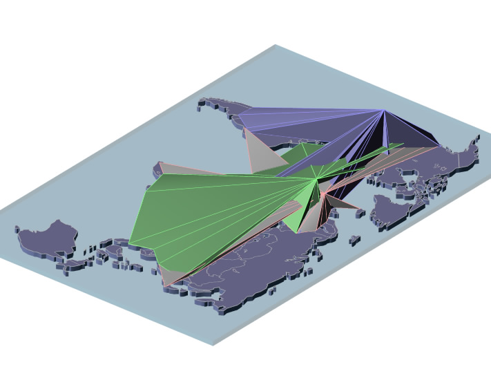
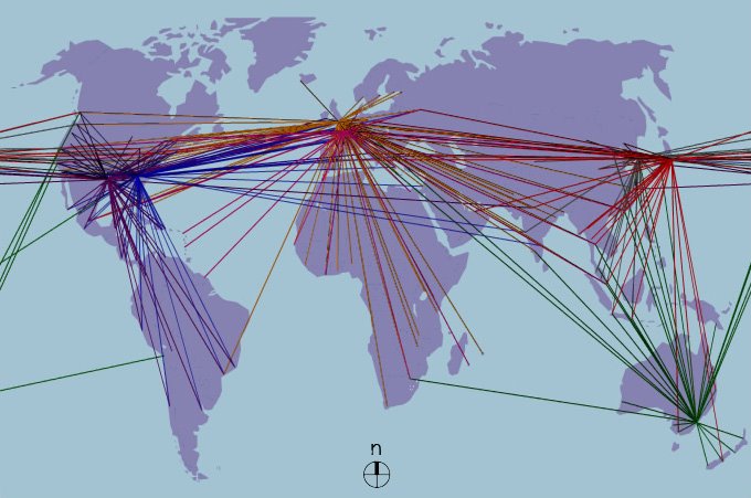
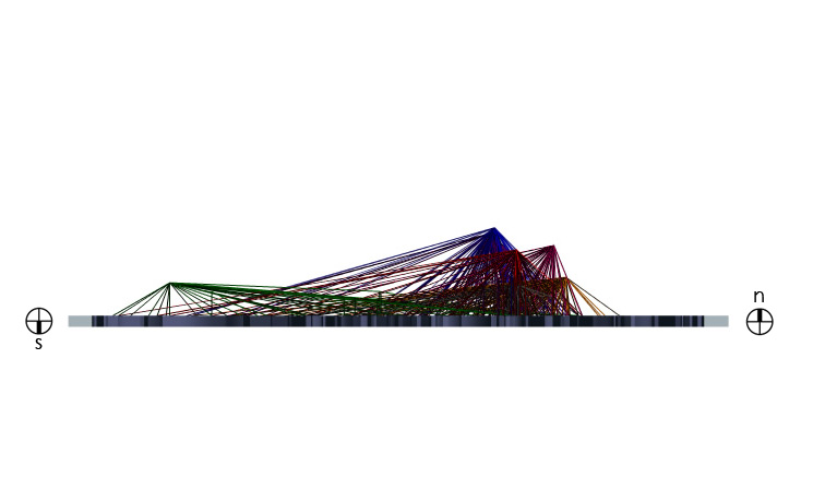
The following images are my mapimation revisions from suggestions made in Wednesday's studio. I have narrowed the focus simply to destination routes of some of the largest air carriers in each continent. For each airline, the main hub was taken and each major destination served from the main hub of a particular airline was simply connected with the hub. In the top view the map begins to develop a dominant area or "world" which each airline dominates. In a three dimensional view, the data has been mapped as topography, almost like a mountain range; the largest carriers have taller peaks. Giving the data a three dimensional presence creates an interesting new way to explore the map, it can be viewed in elevation and my hope is that well place sections will also help to reveal new patterns. Elevations views help to put into perspective what parts of the world certain airlines are more prevalent in. For instance, of the mapped airlines, British Airways seems to dominate the northern most part of the globe, while Qantas Airlines clearly dominates the southern hemisphere. In plan, while the graphic is still somewhat weak, one can make out distinct patterns and connections that are directly related to earlier historical movements. The imperial ages of France, Holland and England, for instance, become very obvious through their continuing ties. One can see a strong correspondence between these nations and thier current and former territories.

Seven of the world's 20 largest airlines have been mapped, the colors coordinate to the airlines as follows: blue=Delta Airlines, purple=American Airlines, magenta=Air France/KLM, red=Japan Air, orange=British Airways, green=Qantas Air, and gray=Korean Air.


The next step will be to find a way in which animation can make certain patterns and the overall mapping clearer to understand. I also hope to add a volume to each of the flight paths rather than just a line. I hope that solid mass will create an airline mountain range across the globe which can be cut in different areas to study in section, in plan, in elevation, and hopefully also from a perspective point of view. Let me know if you have any suggestions on what you think could help the mapping.

Monday, October 09, 2006

10.09.03 Mapimation Update

These updated animations show five of the world's largest airports over the past 25 years and their growth. Chicago O'Hare, Hartsville International (Atlanta), Los Angeles International, London Heathrow and Tokyo International airports are represented by thier corresponding metaball forms. The forms symbolizing each airport grow with the increase of airport traffic over the years. The paths connecting the airport metaball forms work in a similar fashion, that is, the diameter of the tubes connecting the airports corresponds to the amount of traffic traveling between the two points connected. In these videos, the tubes are speculation and do not yet reflect factual data. The nodes off of each central metaball form representing an airport symbolize generalized "spokes" of traffic leaving each airport to give a sense of connection linking the different points; while the representation of these side nodes in the posted animations are also speculation, the final animation hopes to point out patterns of connection between different corners of the world. The final project will map about 15 of the world's largest airports and their major connections over time in an attempt to discover if this information parallels with other social demographics. Here are the links to two animation studies; top view animation and perspective view animation.

Hopefully a more elaborate revision of the previous animations can be combined with a mapping of demographic statistics such as, standard of living numbers, per capita income, or city population growths and reflect a relationship between a city and its connection to the rest of the world. My hope is that these studies will offer a valid study of population growths, population shifts, economic development and global relations over the last two and a half decades.

Wednesday, October 04, 2006

Mapimation Proposal

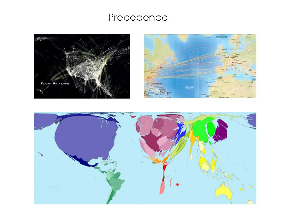
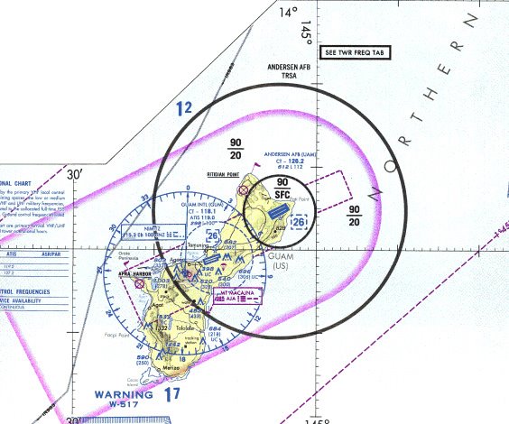
Continuing from the blog post on flight routes, my mapimation project will focus on the network of global flight patterns and air travel. My hope is to allow the overall visual appearnce of the project to have a connection with typical avionics mapings and flight charts to display data analyzing the growth and transfromation of air travel over the past 40 years or so; and example is posted below. The hope is that this study will offer new insight to issues beyond the narrow scope of air travel and that it will offer more general facts regarding changes in the political, social and economical status of the globe.

The first attempt at my mapimation is linked below. This animation is a fictional representation of Hartsfield-Jackson airport in Atlanta and its growth over the last 40 years. The metaball forms are used to represent the size of the airport in number of passengers per year, the main routes flown from the airport and the average distance of flights traveling from the airport.
Click here to see the animation. Also, this video, links to a 24 hour mapping of flights entering and leaving Hartsfield-Jackson International Airport.