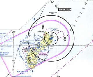
Continuing from the blog post on flight routes, my mapimation project will focus on the network of global flight patterns and air travel. My hope is to allow the overall visual appearnce of the project to have a connection with typical avionics mapings and flight charts to display data analyzing the growth and transfromation of air travel over the past 40 years or so; and example is posted below. The hope is that this study will offer new insight to issues beyond the narrow scope of air travel and that it will offer more general facts regarding changes in the political, social and economical status of the globe.
The first attempt at my mapimation is linked below. This animation is a fictional representation of Hartsfield-Jackson airport in Atlanta and its growth over the last 40 years. The metaball forms are used to represent the size of the airport in number of passengers per year, the main routes flown from the airport and the average distance of flights traveling from the airport.
Click
here to see the animation. Also,
this video, links to a 24 hour mapping of flights entering and leaving Hartsfield-Jackson International Airport.


1 comment:
How much cost generic and brand ambien in United States?
Post a Comment